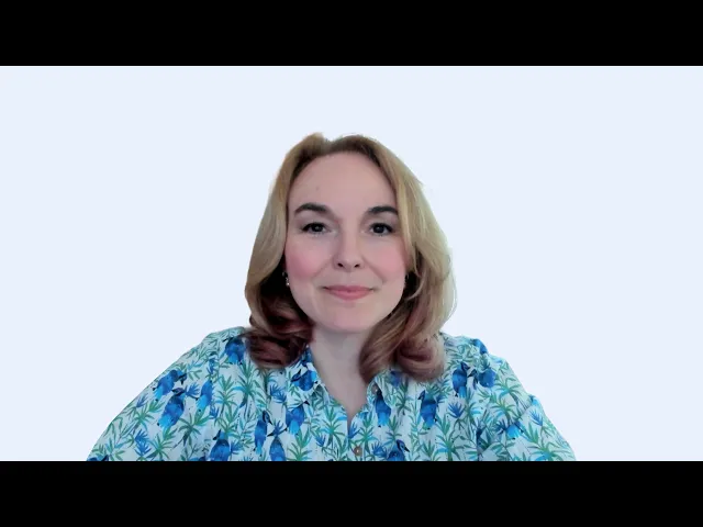
A rebrand from a corporate brand to a personal one: identity, website, and a style guide the client's team still designs with today.
A rebrand from a corporate brand to a personal one: identity, website, and a style guide the client's team still designs with today.
My role:
Design the brand end-to-end: identity, website (UX and UI), a full marketing kit, and a documented style guide her team still uses today.
Client
Samantha Hartley
Industry
Business consultancy
Category
branding · web · graphic design
Tools
Figma · Illustrator · Photoshop · InDesign · PowerPoint
Link

Overview
Samantha Hartley helps corporate consultants grow from around $500K to $2M, but her online presence didn't match the level of her work. She was retiring her corporate-sounding brand, Enlightened Marketing, to build a personal brand around her own name, and needed a site that finally walked the talk.
The consulting world she competes in looks masculine, functional and dull, yet every site in it is ruthlessly conversion-focused. Samantha wanted a brand that felt like her: bold, calm, confident, "a queen, a warrior, a teacher," with Audrey Hepburn as her reference: luxurious but down to earth. My job was to bring warmth and femininity in without losing the conversion discipline. Beauty in service of conversion, not instead of it.


From an off-brand site to her own name
The old site ran on a generic theme that undersold her. The rebrand retired "Enlightened Marketing" and rebuilt everything around Samantha Hartley, the person clients actually hire.

A website designed for warmth and conversion
Structure first: wireframes and a black-and-white pass, so the early decisions were about hierarchy, not color. Five key pages (Home, About, Podcast, Episode, Contact), each with clear calls to action and opt-in forms designed to feel genuinely inviting.
"I'm super glad we have the site done. It's really gorgeous, and I'm proud of it."

An identity with rules behind it
The full visual language: a font-based logo, a type pairing with ready paragraph styles, color combinations, content blocks, patterns and floral elements, all drawn from a moodboard and references we built together. It ships as a brandbook with clear rules, so Samantha's team produces on-brand visuals straight from the guide, without me.
"She helped me explore the visual language and create something really extraordinary. The website is so gorgeous, and all the materials are so beautiful. I'm proud of it." — Samantha Hartley

A lead magnet worth opting in for
"The Consultant's Guide to Winning 6-Figure Clients" is a ten-page branded ebook that became Samantha's main lead magnet: proof that even a giveaway could be beautiful and on-brand.

A logo built from her own name
Combines a font-based wordmark with a floral motif, developed from several directions, restrained enough to emboss yet distinctive enough to carry the brand on its own.

A marketing kit her team can run without me
Covers for five social platforms, podcast art, ten post templates and a slide deck, all built from documented rules, so her team produces on-brand visuals on their own.


Results
"The website is so gorgeous, it's just stunning, and all the materials are so beautiful. I'm proud of it."
"She asked amazing questions and was very thorough."
"I didn't really know what I wanted it to look like, and I couldn't imagine what this next level was. She was very helpful in helping me explore the visual language and in creating something really extraordinary."
"I've been able to take the style guide she created and have other people on my team implement visuals based on it, because she was so clear in expressing exactly what things should look like, with rules behind the design."
Samantha Hartley
Founder and CEO